


Uber, the company is brilliant.
They made a great transition from being the town car aggregator to the transportation platform for the masses. Few can pull off a global scale platform like them.
But, few will mess up a logo transition like them.
Inspirations can come from the bathroom tiles. Wired can wax eloquent about the extravagant intercontinental flights that resulted in this logo. But if all they can finally manage is a badly executed version of the State Bank Of India logo — a bank that stands for slow, frustrating and archaic experience for a billion people, the narrative of “radical rebranding” sounds too hollow to raise a toast for. Sorry, Shalin. I feel for you, man!
We are disheartened.
We are so disheartened that we decided to do what a self-respecting, bootstrapped, stealth-mode product will never do.We are announcing the launch of PipeCandy with the unveiling of our logo and a narrative that are better than Uber’s by a long mile.
We’ve the same ambitions as Uber. We are in fact building ourselves to be the Uber for sales reps (on-demand information of a special kind — wink, wink — we’re still stealth-ish!) because we are heavily inspired by them.
Without much ado, here’s our logo story. We’re paying back with gratitude to Uber, for inspiring us and I hope they’ll do a better PR spin around their new logo in the days to come.
The PipeCandy Logo Story
Very few things are exciting and exasperating at the same time as creating a visual identity for your brand.
Find a name for your startup used to be exciting, until domain name search sucked the joy out of it.
Well, I am digressing.
As we kicked off the Part 2 of our journey which started with ContractIQ, we needed a new name and a new identity, to mark the new product initiatives that get rolled off of ContractIQ.
We’re launching a suite of tricks and tools that will help a sales guy do less traditional prospecting and more handshakes with warm prospects (Oops. The lord of stealthiness isn’t going to be thrilled!). Zeroing in on a name for it wasn’t too difficult.
We named it PipeCandy. It stands for the pipeline that a sales person lives and breathes every day. It stands for the addictive nature of candies, which we hope to bring to our product, through the daily dose of information that sales rep can get from it.
Giving PipeCandy a visual identity was a fun challenge. We stumbled upon a fun and young name, that also connects well with the process of selling. We needed a logo that stood for both.
We did not visit our offices in Nigeria or interview our Chinese counterparts because we don’t have them. Instead, we holed ourselves up in the 8th floor, where we’ve our new office. Ranches are passe for those who don’t own them!
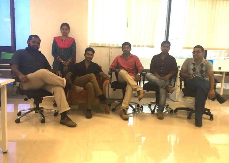
The men in their fancy boots are actually developers & data science guys and they did not intrude in the logo-making endeavor. But then, it seems customary to have a group photo of a SWAT team, even if they are irrelevant to the design process. And, I hope we got the diversity balance in the photo. #NoBrogrammersHere.
The guy at the far most right is me and I did influence the designer a bit. Travis inspired me to intrude into the design process but I am not yet that flamboyant to wear red-colored shoes like he does.
Of course, my inspiration stopped with getting the group photo & when my ideas were summarily rejected by our designer. Our logo story is better and original, as you’d see below.
How We Arrived At Our Logo Mark
We brainstormed to create a word cloud — to unearth associations and completely unconnected words that one could think of, when hearing the word PipeCandy.
Here are some, we came up with:
Slurp, Sweet, Sticky, Pink, Orange, Breach candy (I don’t know why!), Popsicle, LollyPop, Kid, Gay Abandon, Joy, Delirious and so on.

Instant, Joy, and Pleasure kept recurring as choices of words.
The North Star
From spontaneous word associations, we broke out to delve into the meaning of our existence; our north star, if you would.
Our north star would be to make a sales person efficient and intelligent in his / her pursuit of customers. We stand for efficiency, focus and most importantly better results for the sales community.
The Logo Ideas
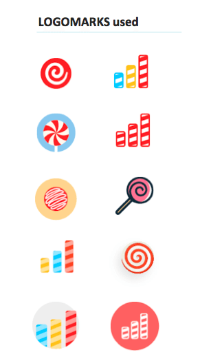
We had fun, joy, pleasure, and such words on one side and focus, efficiency and results on the other side. We went to the drawing board with our in-house designer Arun (after an unproductive experience with 99Designs — to their credit they refunded fully!)
We tried close to 50 variations for the visual mark.
Your’s truly came up with some very lame options, before doing the right thing — let the designer lead. Travis should’ve done that with the new Uber logo! Shalin Amin — if ‘He’ still pokes around, you could join us!
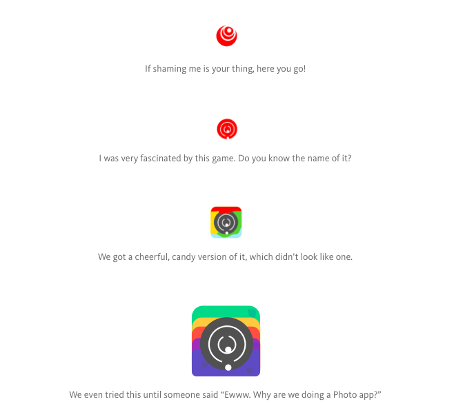
At this point, we had to break away because the logos weren’t conveying the emotional and functional associations of the brand that PipeCandy is. We (honestly, it was Arun) came up with the following in our second iteration.
The very first logo mark looked like a worm for some, Target’s logo for some others (which is better than the State Bank’s logo) and an adjacent product in the same space, for one of us. From literal interpretations via line drawings to top-view of muffins to swirls, we tried them all.
And then, we happened to have ContractIQ open on one of the tabs and saw this.
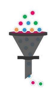
ContractIQ’s logo, in spite of some of its misgivings, had one thing going for it — the funnel articulated what we stood for — filtering options and making precise matches, as we proceeded through the evaluation funnel.
PipeCandy stands for the same precision, focus and the funnel itself, albeit from the sales guy’s perspective.
So we took the funnel.
The Word Mark
I will come back to the logo mark in a bit.
With the name like ‘PipeCandy’ we knew we could afford to be fun and sprightly. Cursive fonts suited this well. The P and the C lent themselves well for cursive writing as well.
We tried the following options, with various funnels for the visual mark.
And then we tried some more cursive…
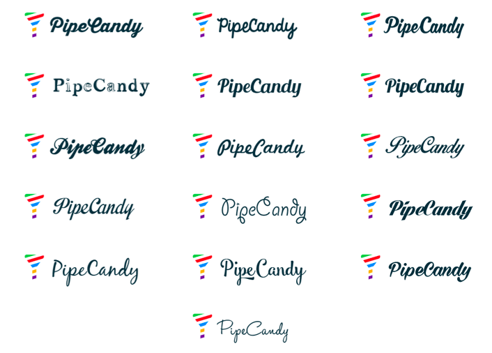
And none of them came close to the first one (which is Thirsty Script ExtraBold)
We then made some adjustments to the dimensions, removed the negative spaces, cut a slant on the bottom of the funnel, from what was originally a flat tip. We chopped the length of the narrow part of the funnel (Hello, Golden Ratio!).
Chop, chop, and chop, we landed here…
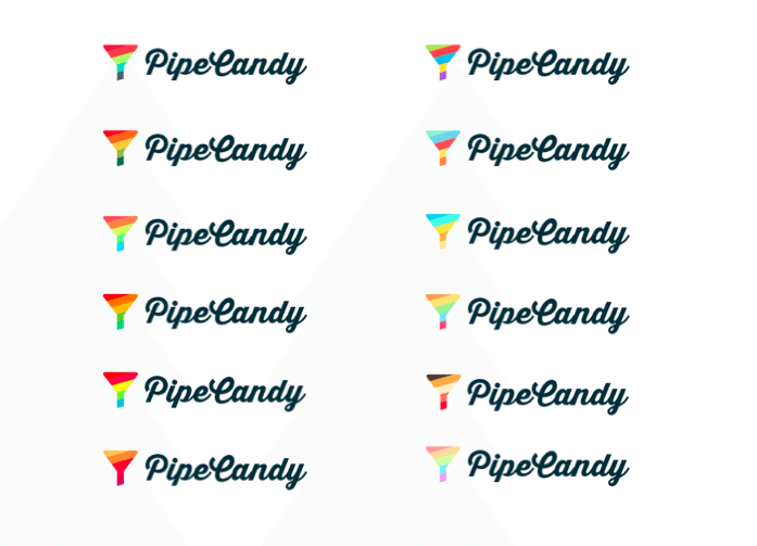
We are going to a suite of products and we needed multiple colors to differentiate the products and of course, what’s a logo without multi-color when you have candy in your name?
The funnel represents efficiency, focus and our customer’s everyday activities that drive their sales. The colors represent fun and joy. The upward slant represents growth.
The Logo
We zeroed in on…
So What’s The Big Deal?
We care. We sweat out for abstract details of building a brand because it matters that we tell a cohesive story to our audience of employees & customers.
Our mission is lofty, but we’ll sort out the tiny bits of details like we’ve done with the logo!
PipeCandy is launching soon. If you are a good sales person already, we’ll make you awesome. Sign Up to our list & we’ll invite you with some generous goodies (and candies, of course)!