


Raviteja Govindaraju
Ravi is currently working as a product designer at Hatchforce. He is a self-taught UI / UX designer with good experience in designing user interfaces of web and mobile applications.
The key problems with the traditional navigation menu design (the one with a hamburger icon on top) are as follows:
Reaching the hamburger menu on the top is a painful task as it lies in the “non-accessible” zone of the thumb.
I should change the position of my phone and fingers in order to tap it which often leads to a mild pain in the thumb joints.
The mobile screen sizes are getting bigger every day. For instance, iPhone 5 series phones have a height which is 176px more than iPhone 4 series phones.


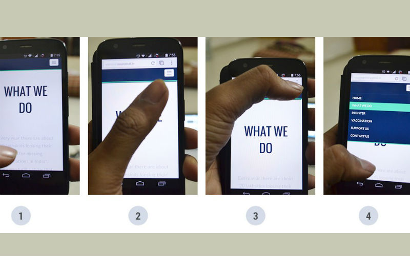
A different navigation approach can be something like this:

What does it solve?
- Menu can open up anywhere on the screen — i.e. easily accessible by any finger and in any position
- More real estate to show more content which is a big +ve
- Content is not hidden while navigating to other pages or links. i.e. You are always aware of where you are
- Works on any screen size
- Opens up lots of possibilities in design
- Looks sexier
What do you think? Would you use such a menu system or do you prefer the current one?
![[#StartupUX] A Different Approach To Navigation In Mobiles-Inc42 Media](https://cdn.inc42.com/wp-content/uploads/2023/09/featured.png)
![[#StartupUX] A Different Approach To Navigation In Mobiles-Inc42 Media](https://cdn.inc42.com/wp-content/uploads/2023/09/academy.png)
![[#StartupUX] A Different Approach To Navigation In Mobiles-Inc42 Media](https://cdn.inc42.com/wp-content/uploads/2023/09/reports.png)
![[#StartupUX] A Different Approach To Navigation In Mobiles-Inc42 Media](https://cdn.inc42.com/wp-content/uploads/2023/09/trackers.png)
![[#StartupUX] A Different Approach To Navigation In Mobiles-Inc42 Media](https://cdn.inc42.com/wp-content/uploads/2023/09/perks5.png)
![[#StartupUX] A Different Approach To Navigation In Mobiles-Inc42 Media](https://cdn.inc42.com/wp-content/uploads/2023/09/perks6.png)
![[#StartupUX] A Different Approach To Navigation In Mobiles-Inc42 Media](https://cdn.inc42.com/wp-content/uploads/2023/09/perks4.png)
![[#StartupUX] A Different Approach To Navigation In Mobiles-Inc42 Media](https://cdn.inc42.com/wp-content/uploads/2023/09/perks3.png)
![[#StartupUX] A Different Approach To Navigation In Mobiles-Inc42 Media](https://cdn.inc42.com/wp-content/uploads/2023/09/perks2.png)
![[#StartupUX] A Different Approach To Navigation In Mobiles-Inc42 Media](https://cdn.inc42.com/wp-content/uploads/2023/09/perks1.png)
![[#StartupUX] A Different Approach To Navigation In Mobiles-Inc42 Media](https://cdn.inc42.com/wp-content/uploads/2023/09/readers-svg.svg)

![[#StartupUX] A Different Approach To Navigation In Mobiles-Inc42 Media](https://cdn.inc42.com/wp-content/uploads/2023/09/twitter5.png)
![[#StartupUX] A Different Approach To Navigation In Mobiles-Inc42 Media](https://cdn.inc42.com/wp-content/uploads/2023/09/twitter4.png)
![[#StartupUX] A Different Approach To Navigation In Mobiles-Inc42 Media](https://cdn.inc42.com/wp-content/uploads/2023/09/twitter3.png)
![[#StartupUX] A Different Approach To Navigation In Mobiles-Inc42 Media](https://cdn.inc42.com/wp-content/uploads/2023/09/twitter2.png)
![[#StartupUX] A Different Approach To Navigation In Mobiles-Inc42 Media](https://cdn.inc42.com/wp-content/uploads/2023/09/twitter1.png)