


Chatbots, as they exist today, do not have many capabilities to understand natural human language. And this is one of the main reasons why most of the messaging apps(Messenger, Kik etc) are resorting to a mix of graphical and text UI in their bot platforms — think of buttons, carousels, image cards and not just text responses.
We, at Tars, are using the browser as a platform to build our own chat interface for bots to operate. And this gives us complete liberty on what all components we have. If you have tried any of our bots(if you haven’t, first try one out here and here), you would know that we strongly support the graphical UI + text-based approach. As a part of this thought process, we have created a number of custom keyboard inputs in our front-end interface to facilitate different user interactions and situations.
Messenger, Kik, Telegram are huge platforms where developers are deploying hundreds of bots each day. I still feel these messaging platforms have not done enough on the front-end components to help a boomaker create enriching user interactions.
And that’s why, I wanted to talk more about how we went about creating each custom UI, why each one of them makes sense and how the lack of them screws up user interactions right now.
So here we go:
Date and Time Scroller
Think of a scenario where you need to ask a user when he would like to make the appointment for? There can be multiple ways of giving the same information.
25th Nov, 25th November, Nov 25th, 25/11, 25–11–2016, 11/25/16 — all of them essentially mean the same but it becomes difficult for a machine to make sense of this data.
This is why we have incorporated a date and time scroller where users can roll the dials and select the date/time.
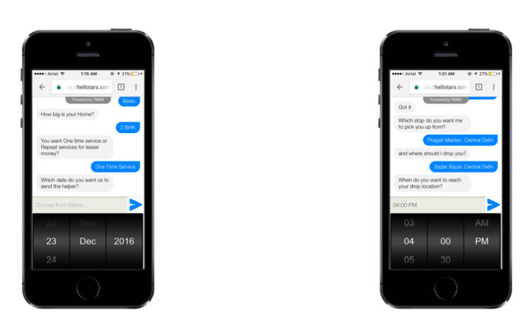
I haven’t seen any other messaging platform provide this UI till now and I feel this is a must have if a bot is asking for date or time from the user.
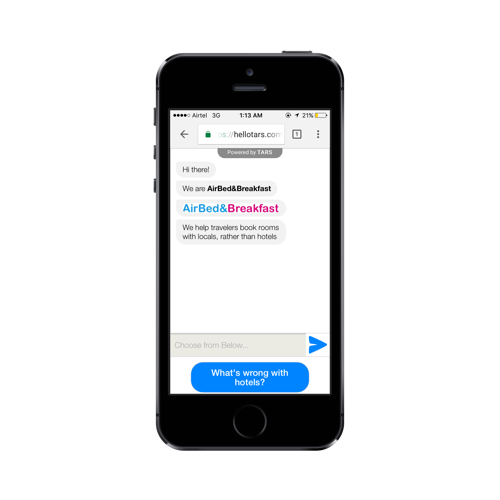
Vertical Buttons
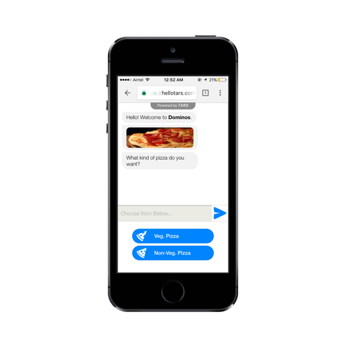 Think of these as multiple choice options in a form where you have a limited number of things to choose from. Tapping on buttons makes the interaction quicker and also keeps the scope of the conversation limited.
Button based approach makes sense when you have to choose between a veg and non-veg pizza but it might not be the best UI to have if you have 100 insurance policies to choose from.
What more can be done with vertical buttons?
- add an image next to each option to make it more visually appealing.
- you can either let the user respond to a single tap or make him click on “Send” after he taps on any of the options. The latter helps in reconfirming if the user didn’t select the particular option by mistake. There is no way to go back in a chat flow and that’s why this customisation makes sense.
- add a quick info menu to each option to provide detailed information and make the decision-making process better.
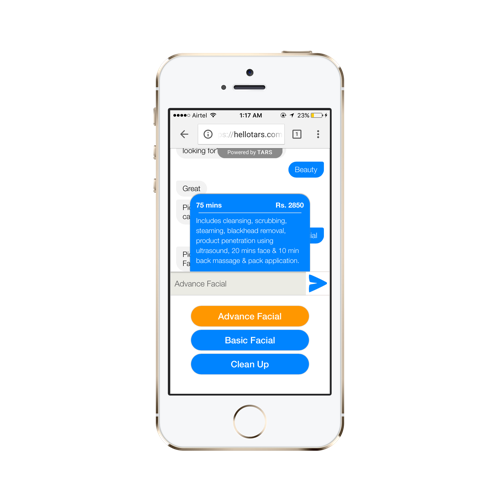
Not everyone knows the difference between Advance and Basic Facial. Adding details around what all is included and pricing makes the user experience better.
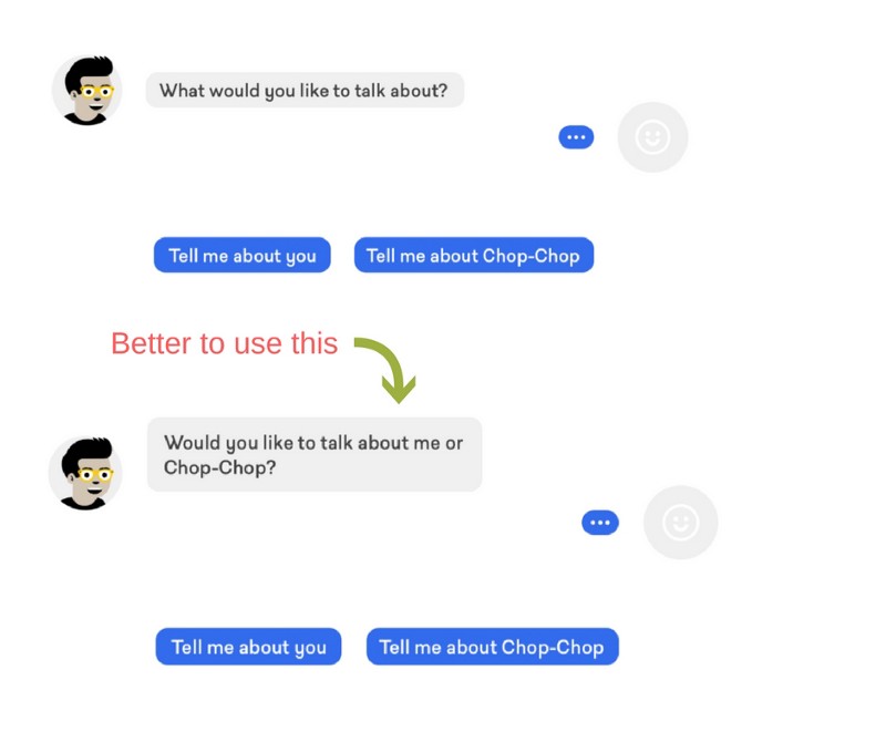
One more important thing to keep in mind when you use Button UI is to frame your question the right way. As Leszek explains in his article here, it’s better to ask the question in a way that limits the range of options and sets the context instead of asking a very open ended question.
Restricting User Input
I feel this is one of the best things we have done to our chat interface. Whenever we provide a graphical input UI(buttons, carousels etc), we do not allow the user to type in anything in the text.
Why do that? Because a user can type in anything out there and your bot is not ready for that. Until you are there, it’s better to keep it simple and restricted rather than breaking the conversation.


What we do is this:
This is our chat interface
And this is what happens when you don’t have something like this:
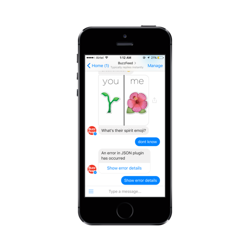
This is Facebook Messenger which doesn’t allow restricted text input when you have quick replies
Done and Pass button
These are two very small nuances we ended up incorporating because we have always thought of scripted chatbots as an evolution of forms.
When you are sending across your address or giving a detailed feedback over chat interface, general behaviour is to press the send button after writing a few words and the whole response is eventually spread across 3–4 statements. With “Done button”, you can keep typing and press this once you have given the complete response.
If you don’t have such an option, the machine’s next message would come after the first instance itself resulting in incomplete responses.
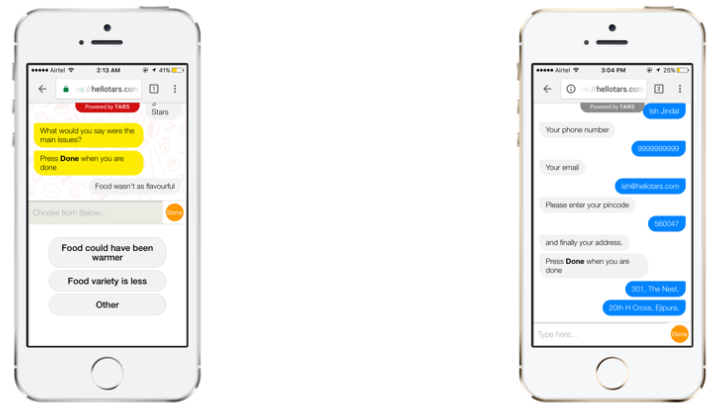
Have a “Done” button when you have to select multiple options or have multi-lined responses
There might also be cases where a user wants to skip the question and for that, we have a “Pass button” in place of the “Send button”. As soon as the user starts typing, Pass button turns into Send button.
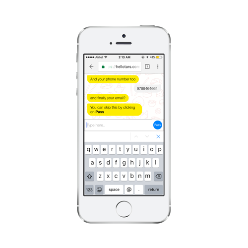
Don’t want to give your email? Tap on “Pass” to skip the question.
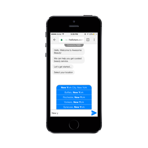
Autocomplete Suggestions
This is like autocomplete functionality in google search where you start typing and it suggests the possible options. This becomes particularly useful when you have a long list of options and having vertical buttons is not a feasible option. Think of a long list of localities, cities, car models etc.
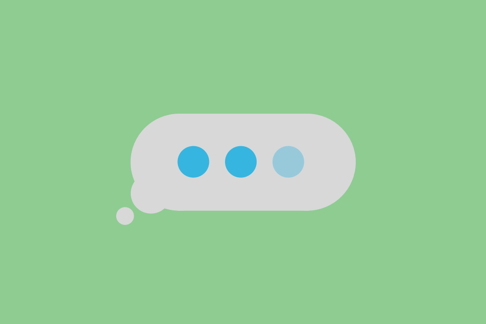
Stars and Likes
Especially useful when you are asking for user feedback or experience and the response is more qualitative in nature. And you can even customise the icons to be stars, likes, hearts, emoticons.
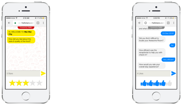
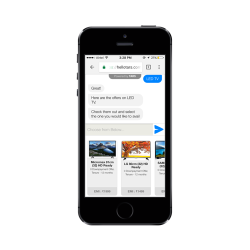
Image Cards
This is useful where you need to showcase multiple pieces of information about each item at one go. Could be a burger in a food ordering process or a shirt in a shopping flow. All the cards are stacked against each other and you can scroll through to look at all the options.
There are 4 parts of this UI element — image, title, description and footer. You can utilise these differently depending on what you want to display in there.
In case you want to test out all these input UI elements, here is the link to a chatbot which takes you through one at a time.
Chat being a minimalist interface with just bubbles and a text box doesn’t give much scope. And I believe we will have to rethink how we can facilitate a variety of interactions by using the existing elements and adding new ones to the chat interface.
Would love to know if you have been playing around with the messaging interface yourself and have added some other cool GUI elements to it? 🙂
[This post by Ish Jindal first appeared on Medium and has been reproduced with permission.]