


Today, if you are on a hunt to buy or rent property in India, and haven’t heard of Housing.com, then either you aren’t hunting it right, or you have been living in a cave all these years.
Housing.com is undoubtedly the pioneer of smart online property discovery in India. They are the ones who turned the tables upside down, and brought the much needed simplicity and sexiness to the online property listing and search space. And with their latest re-branding, they have tried to up the ante and add that extra oomph to the game.
I recently took their website for a spin, and had a few observations. And while most parts of the site impressed me, I believe some sections need a little more work to perfect the overall user interface and experience. Read on to find out more.

COLOR INFLUX
The moment you land on the website, you are presented with a very visual and beautiful treatment of color, which is also aptly launched during the Holi festival mood across India.
The entire website and the use of colors have a distinct personality to it. Maybe Housing wants to convey that they are no longer a coy and starry-eyed little startup, but a young and energetic company that is growing fast and very stylishly at that. Their Look Up showcase page is worth a visit.
Now playing with color can be tricky, and one would often find it difficult to draw a line, as where to stop, and not end-up over doing it. But the design team at Housing has done a fantastic job.
With that said, there are still certain areas where the user experience takes a small hit, because of poor choice of color. Keep reading, to know more about it, ahead in the article.

SEARCH PAGE
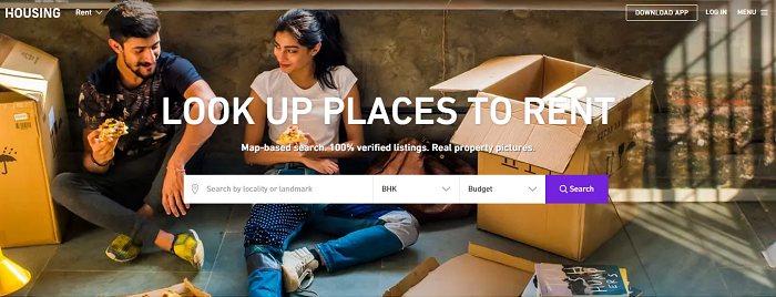
To get down to business now, I started by conducting a dummy search to rent a 2 BHK in and around Mulund West, an upcoming central suburb in Mumbai, where I stay.
The landing page design for Rent was pretty welcoming, with professional photographic backgrounds, good use of fonts and well spaced form elements. The backgrounds could have used a slight blur effect so that the text and fields were much more readable, but again a little unconventional approach doesn’t hurt anyone.
Now what I particularly like about this page is that it doesn’t overwhelm you by asking too many unnecessary details at the beginning, and lets you quickly run a search with the minimum number of data fields required. But yeah, a smart auto suggest drop-down on clicking the Location field, for first timers, would have sealed the deal.
You see, some of the best user experiences are designed in such a way, where the user is able to reach from Point A to Point B in as fewer clicks as possible, and by providing as minimum information as possible, or in some cases by not having to touch the keyboard at all.


RESULTS PAGE
Map View
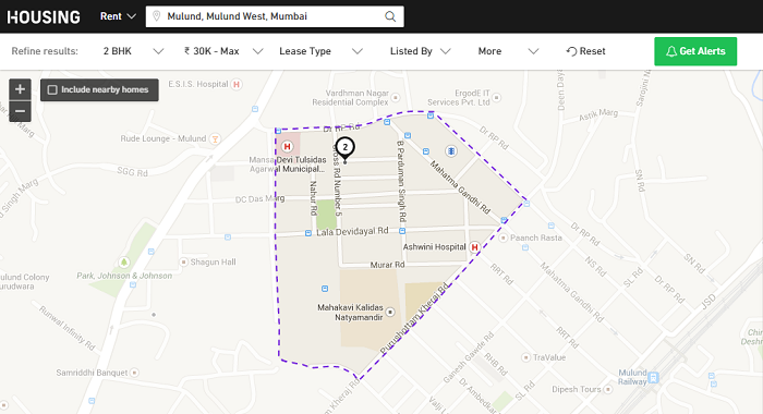
Once you are on the Results page, you can see the familiar Map view interface, covering well over 70% of your screen, in typical Housing.com style.
A few niceties that have been added, or rather subtracted, are the White and 1 color theme, and highlighting the concerned location with a dotted border while blurring the rest. Maybe this feature was available before too, but is still a nifty little thing to have.
Also, the “Include nearby homes” is a smart feature because it gives you a comprehensive picture of property options in the adjoining 5-10 kilometer radius of your preferred location, but I would have loved to see a feature which would allow me, or if I may say lure me, to see the number of properties (in parenthesis) available in higher or lower price brackets, at the tap of a button.
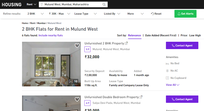
Now while I was fine with most of the things I was seeing, something really struck me. How can there be only 1 result for a 2BHK in the lease range of 30K – Max. At first I thought maybe the market supply is limited, but on further probing I found that the area on the map and its periphery were all wrong. It wasn’t highlighting entire Mulund, but only a very small area in Mulund (See screenshot below). Then after spending almost 20 minutes going back and forth on various search combinations, I figured out that the website had in fact 2 locations in their database, namely “Mulund, Mulund West, Mumbai” and “Mulund West, Mumbai, Maharashtra”. And the other option showed the correct and full surface area of Mulund, along with many more properties listed under it (See screenshot under List View below).
So maybe it is one isolated bug in the system that got missed, or maybe there are more such duplicate location entries that need to be fixed, but they need to be fixed fast, lest their users get an impression that Housing doesn’t have a lot of property options to show.
List View
Now when I switched over to the List View, I was pretty disappointed. I mean, I was so far enjoying the new look and colors, and suddenly I was seeing an overload of information loosely thrown around the entire length and breadth of the screen.
I know that given the nature and complexity of their product, it isn’t easy to decide what appears upfront and what is hidden behind more details, and what color combination and font size to use for different information, but this page require a little work, before it could match-up with the rest of the site. Right now there are too many things happening on this screen.
You see, the trick behind having an excellent user interface is to have all the necessary information available on the screen, but still present it in a way that the users’ eye is not required to strain its way through the information. It should just naturally flow in such a way, that data comes as a treat to the eye, maybe one step at a time, with the correct use of different shades of color. Maybe they can take a leaf or two on this, from Airbnb.
FRINGE FEATURES
Only when I was thinking that this website took me high and then left me dry, I was pleasantly surprised to come across their Data Sciences Lab. This section of the site is class apart. It is something that perhaps separates Housing from its competitors, but is for now nested deep inside the menu table.
Traffic Flux, Inventory Demand Supply, Heat Maps, Visibility Index, Lifestyle Rating and the works, are a breadth of fresh air. If Housing can come-up with ways to take this intelligence, add a social layer, and merge it with the default search experience, we would be able to see a new and promising breed of property discovery.

To conclude, Housing seems to have charted out a bold new direction, and is surely up to something big. Add to that, the ever-changing dynamics of the realty sector and the introduction of advanced technology by competition (CommonFloor Retina), is sure to keep them on their toes for at least the next couple of years.
Now whatever the next few years entail, users are surely in for a delightful ride.
Watch the complete video below:
Vijay is the founder of Mindsparx. He has an insatiable appetite for detail, and swears by everything Apple.”