


Inc42 Daily Brief
Stay Ahead With Daily News & Analysis on India’s Tech & Startup Economy
Buzzfactory
Buzzfactory is a social media & digital agency.
The mobile first approach
It’s nearly 2015 and through 2014 we’ve already crossed over into the era where mobile devices accessing the web have out-numbered PCs and laptops. As a digital company we’ve been using and advocating the need for mobile responsive websites for some time now and have worked on numerous web redesign projects ensuring the user experience is in tune with the way people browse in the present day. The way we saw it even two years ago, there is no excuse for not updating your web user experience or website to ensure it offers a good experience to users with laptops, PCs, tablets, iPads, smartphones and multiple screen sizes. Since the website is often the foundation of building a digital presence, responsive websites were the need of the hour. But that was then. This is now.
Now, the smartphone has captured an even bigger share of devices accessing the web and the user dynamics of mobile device usage (smartphones in particular) is very unique even compared to tablets, phablets, PCs and laptops. A mobile web user usually has the device held in one hand, uses a single thumb to swipe the screen, navigate, quickly scan content and hit a button or link. The behavior and usage is unique on a smaller mobile device like a smartphone and what you’re looking for while surfing with your phone is quick, accessible, compact content that fits on your small screen and puts what you need at your finger tips so you can act on it quickly.
While responsive websites are important and do a great job addressing the design aspects of adjusting web content to multiple screen sizes, most responsive websites are still content heavy and designed first for the bigger screens and then adjusted to mobile (smaller screens) which means you still tend to do a lot of scrolling, read through more text, have multiple navigation links and go through what you would expect to see on a bigger screen. This brings us to the need to have an exclusive website or user experience designed first for the small mobile screen much the way great mobile apps are designed to optimize user experience on smaller devices.
After a lot of observation and discussion on the need to take a different approach to those browsing on mobile smartphones versus tablets and larger screens, we used Qliktag our mobile engagement software platform to design and host an exclusive mobile only version of Buzzfactory.net which would only display for those accessing through a phone based device and not tablets, iPads, PCs or laptops.
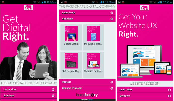
We approached this bottom up starting with the ultimate purpose of the mobile site which was to introduce a few our core solutions and generate instant inquiries with a form fill or call. Starting with the solutions pages, they were linked to a home page or basic root page which addresses who we are as a company. The content was stripped down to be as minimalist as possible keeping the messaging clear and concise while not getting into the drilled down details that our full website for other devices has. The structure of the mobile pages excluded a lot of sections such as about, team, clients, careers and most other sections since it was determined the mobile user is looking up only quick core details before making contact.
The results?
If the first few days are anything to go by, we have seen an instant marked increase in leads generated through the exclusive mobile site. The ease of making a quick decision to ask for a detailed proposal or inquire about one of our services has become considerably simpler with a few swipes of the thumb and a few inputs / calls to action. With the user experience more intuitive for a mobile user, the cycle from creating a first impression, to offering quick access content to finally placing a call to action has been shortened and the results have been exciting.
Our take on this
Is responsive web design important? – Yes extremely
Is having a different version designed exclusively for mobile with exclusive content for mobile also worth considering – Absolutely yes!
Note: We at Inc42 take our ethics very seriously. More information about it can be found here.