Raviteja Govindaraju
Ravi is currently working as a product designer at Hatchforce. He is a self-taught UI / UX designer with good experience in designing user interfaces of web and mobile applications.
The three most popular sites for booking hotel rooms in India are Cleartrip.com, Makemytrip.com and Yatra.com with their alexa ranks in India being 190, 76 and 245 respectively which means they get hell lot of traffic everyday. No doubts in that, in a country with a billion people, travel is unarguably a huge industry. And therefore, ‘hotel search’ is really a huge problem that should be solved, which is what these portals are trying to do.
All these web portals are trying to make the process of booking tickets for flights and hotels as simple as possible. In this post, I would like to compare the User Experience of booking a hotel room in each of these three websites and share my analysis.
1. The initial screen:
Screen where the user enters a few details to see the list of hotel rooms.
Looks cleaner than the rest. But does it mean it’s the best? Lets take a closer look.
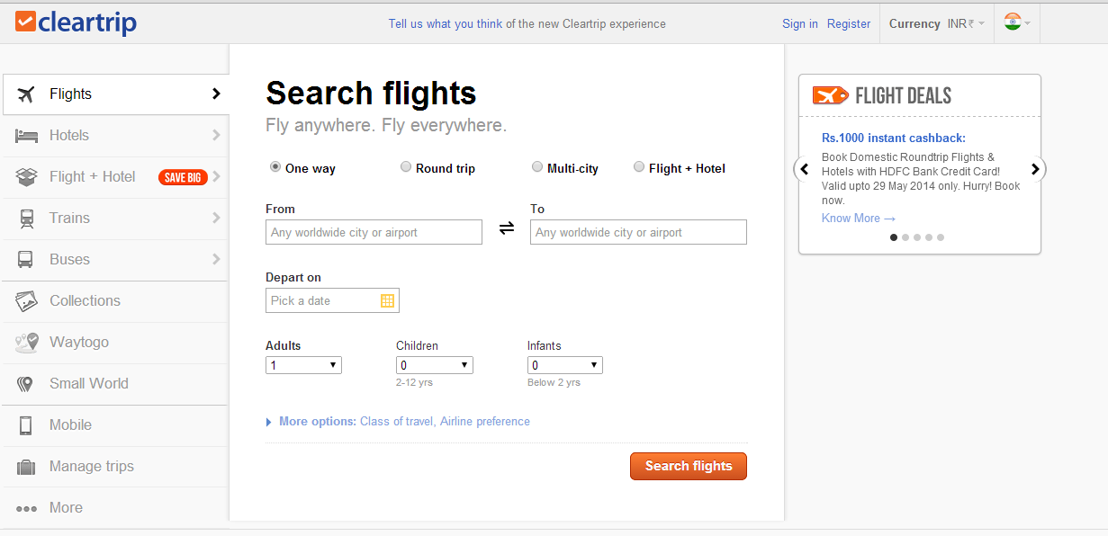
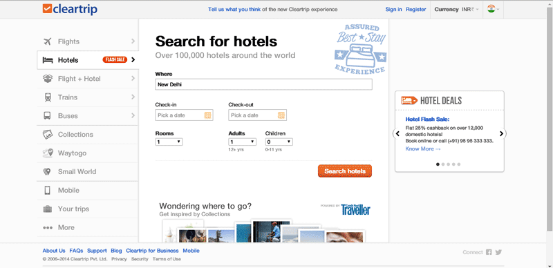
This one says “Search for hotels” in big bold letters while the other two says “Book domestic and international hotels”. Search for hotels — ok, search and do what? Can I book or not? Search for hotels? Can’t I search places? I like it to be simply “Book hotels” or something like that. And I do like “where”. It’s simple and straightforward.
A couple of things I feel can be improved here:
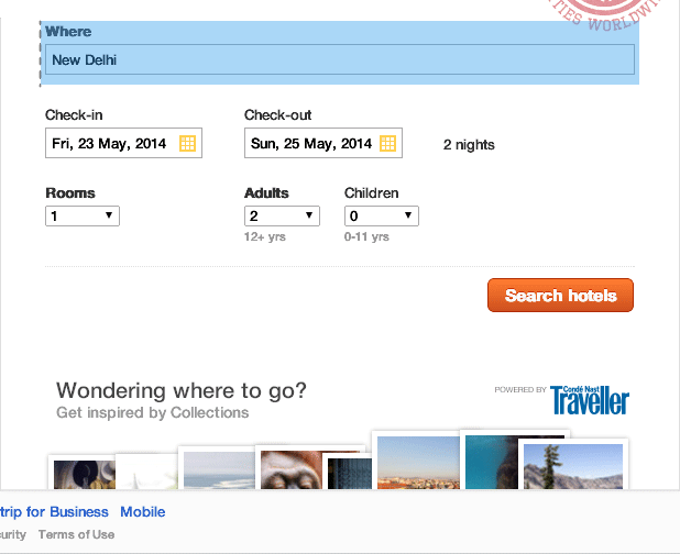
After I populate the check in and check out fields, it shows the no. of nights next to them. However, the way it is displayed is arbitrary.
Instead, the design can be tweaked a bit as shown to make it more clear:
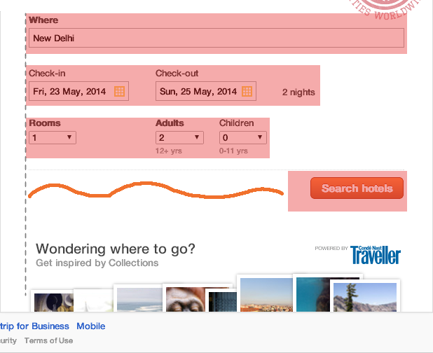
Next, the placement of the “search hotels” button which is the primary Call to Action (CTA) on this screen doesn’t seem to be ideal. This is natural way in which our brain actually scans this page:
but as we can see the CTA is not left aligned but pushed to the right:
Recent searches:


Now, why are “recent searches” important? Because the user doesn’t take immediate decisions while booking hotels. He may check the hotels and prices once in one portal. He may go back and check them in other portal. He comes back next day and wants to check again, still undecisive of what to book. By the time he ultimately decides to make a payment, he would have searched with the same search criteria at least 4 times. He doesn’t have to enter the same search criteria everytime provided he has a quick link in the name of “recent searches”. But if it is difficult to locate this feature, there isn’t much use.
So, we can make use of our powerful and sensitive peripheral vision to do a quick work around for this. What is peripheral vision? You can always google but I will just sum it up for you. Suppose you are in a classroom listening to your teacher with your eyes fixed on him. Suddenly, a dog passes by in the corridor and your eyes immediately turn to see it, don’t they? Why? This is because of the extremely sensitive peripheral vision, which is an evolutionary trait for human beings. Theory says that humans developed this vision as earlier beings used to depend on hunting which means they always had to be on their toes watching for quick changes in the environment surrounding them.
Anyway, we can make use of peripheral vision here to let users take a glance at the recent searches feature with a small animation which can be something like this:
Although the user’s eyes are fixed on the center part of the screen, a little animation on the right will make him take a glance for a second and find this useful feature.
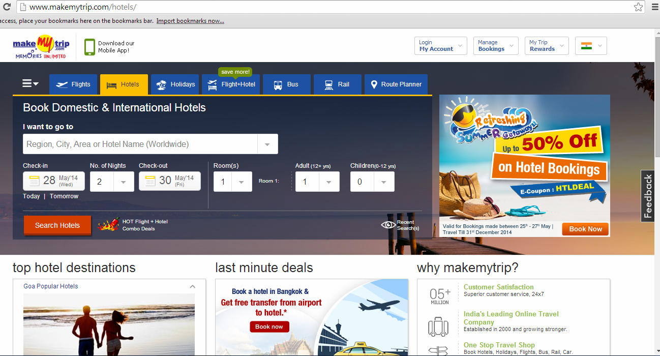
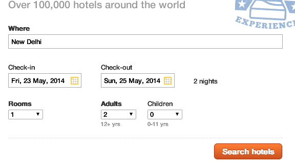
This has more input fields than Cleartrip, yet I find this a bit more useful than cleartrip. Lets take a closer look. It says “I want to go to” and the label says “Region, City, Area or Hotel Name (worldwide)” giving the user a wide range of options to enter and it says it can show results for anything. This is particularly useful because lets say I want to go to Pune. I can just enter Pune here and search. Or lets say I have searched for hotels in Pune in some other site, say Cleartrip and found one good hotel. I may want to check the price of the rooms in that hotel in multiple sites to see where I would be getting the best deal. So, I come to makemytrip and I can directly enter the hotel’s name. This is what this simple input field enables the user to do.
I also like how Check in and Check out are presented. Selecting a date from a calendar dropdown always takes more time than just selecting a number from a simple dropdown. So instead of the user selecting check in and check out dates, here you can select check in date and select the no. of nights you are gonna stay and thereby checkout date is automatically populated. Smart.

Here, the divisions are neatly marked with subtle border lines.
As you can observe, (check in & check out dates) is one set and Rooms is another set. In Rooms, no. of adults & no. of children is a subset marked by dotted line. All of these divisions, although we don’t observe while using it, are made clear with these neatly organized and cleverly designed border lines.
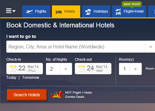
Also, “Flight + Hotel” deals is given a great importance here probably aligning with their business goals. It is emphasized with a red hot chilli right next to the CTA and also on the top menu bar, it comes along with a “save more” popover in green, a distinctive color from the rest of the page. Strong visual differentiation it is.
In makemytrip, the recent searches feature is actually hidden! That is probably because they show “last viewed hotels” after the “above-the-fold” section.
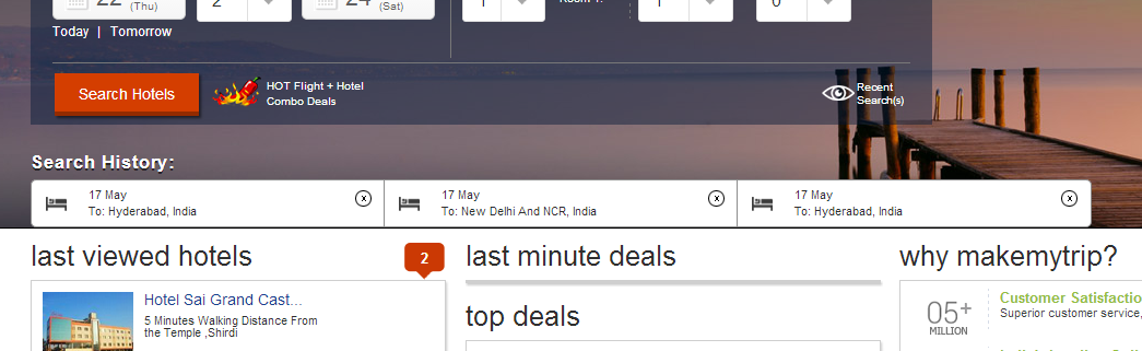
The Last viewed hotels part feels like it is a completely different section and not really related to hotel search task which the user is performing. Hence, there is high chance of the user missing it completely. Although the “2″ marker does help a bit, it’s still not the best design.

On the first glance, the overall page looks a bit cluttered.
In the form, they gave an option to “add a room” while a dropdown for no. of rooms seems to be a better go as we have seen in Cleartrip and Makemytrip. Lets say I want to book 5 rooms. I can save a couple of extra clicks with the dropdown design than this one.
Also, here no effort has been made to show recent searches or deals on hotels or last viewed hotels etc. This is primarly because the hotel search form is still on the same home page but on a different form tab… i.e. in cleartrip and makemytrip, hotels search opens in a new page (cleartrip.com/hotels; makemytrip.com/hotels). But in Yatra, search for flights, hotels, flight+hotels etc. all happens on the same home page (yatra.com) in a different tab. Thus, showing relevant content to relevant searches isn’t taking place which isn’t really a great design decision.
So, as of now, this would be my rating of the UX design of these three portals:
Makemytrip ~ Cleartrip > Yatra
The next part of this series will focus on what happens after clicking on the CTA i.e. search button and the UX of the page where list of hotels is shown.
Stay tuned to Designthoughts for the next post in this series.
P.S.: I don’t work for or represent any of these three organizations in any manner. I just wanted to flex my UX muscles and merely share my observations as a neutral customer. My name is Ravi and I am a product designer at Hatchforce.
![UI / UX Comparison Of ClearTrip, MakemyTrip And Yatra For Hotel Bookings [Part1]-Inc42 Media](https://asset.inc42.com/2023/09/featured.png)
![UI / UX Comparison Of ClearTrip, MakemyTrip And Yatra For Hotel Bookings [Part1]-Inc42 Media](https://asset.inc42.com/2023/09/academy.png)
![UI / UX Comparison Of ClearTrip, MakemyTrip And Yatra For Hotel Bookings [Part1]-Inc42 Media](https://asset.inc42.com/2023/09/reports.png)
![UI / UX Comparison Of ClearTrip, MakemyTrip And Yatra For Hotel Bookings [Part1]-Inc42 Media](https://asset.inc42.com/2023/09/perks5.png)
![UI / UX Comparison Of ClearTrip, MakemyTrip And Yatra For Hotel Bookings [Part1]-Inc42 Media](https://asset.inc42.com/2023/09/perks6.png)
![UI / UX Comparison Of ClearTrip, MakemyTrip And Yatra For Hotel Bookings [Part1]-Inc42 Media](https://asset.inc42.com/2023/09/perks4.png)
![UI / UX Comparison Of ClearTrip, MakemyTrip And Yatra For Hotel Bookings [Part1]-Inc42 Media](https://asset.inc42.com/2023/09/perks3.png)
![UI / UX Comparison Of ClearTrip, MakemyTrip And Yatra For Hotel Bookings [Part1]-Inc42 Media](https://asset.inc42.com/2023/09/perks2.png)
![UI / UX Comparison Of ClearTrip, MakemyTrip And Yatra For Hotel Bookings [Part1]-Inc42 Media](https://asset.inc42.com/2023/09/perks1.png)
![UI / UX Comparison Of ClearTrip, MakemyTrip And Yatra For Hotel Bookings [Part1]-Inc42 Media](https://asset.inc42.com/2023/09/readers-svg.svg)

![UI / UX Comparison Of ClearTrip, MakemyTrip And Yatra For Hotel Bookings [Part1]-Inc42 Media](https://asset.inc42.com/2023/09/twitter5.png)
![UI / UX Comparison Of ClearTrip, MakemyTrip And Yatra For Hotel Bookings [Part1]-Inc42 Media](https://asset.inc42.com/2023/09/twitter4.png)
![UI / UX Comparison Of ClearTrip, MakemyTrip And Yatra For Hotel Bookings [Part1]-Inc42 Media](https://asset.inc42.com/2023/09/twitter3.png)
![UI / UX Comparison Of ClearTrip, MakemyTrip And Yatra For Hotel Bookings [Part1]-Inc42 Media](https://asset.inc42.com/2023/09/twitter2.png)
![UI / UX Comparison Of ClearTrip, MakemyTrip And Yatra For Hotel Bookings [Part1]-Inc42 Media](https://asset.inc42.com/2023/09/twitter1.png)