Raviteja Govindaraju
Ravi is currently working as a product designer at Hatchforce. He is a self-taught UI / UX designer with good experience in designing user interfaces of web and mobile applications.
This is the second post in the series of posts on UI / UX comparison of the three major hotel booking portals. You can read the previous post here.
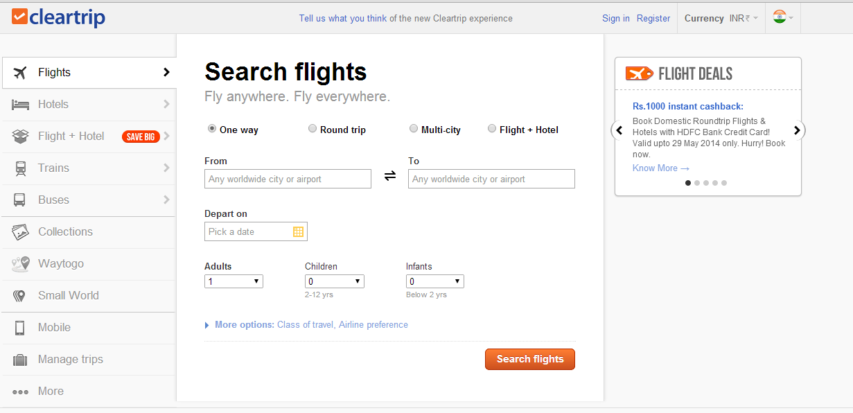
Cleartrip has done an excellent job here. Once the user clicks on “search hotels” button, this happens:

This is a brilliant design because it never makes the user feel that he is waiting. There is information being shown at every point in the step. This is cleverly done by loading the images (which are heavy in size compared to text) at the end of the process. After all, images are not the most important thing anyway here.
Coming to the listings, firstly it shows 3 complete results above the fold as compared to 2 in makemytrip and 1.5 in Yatra. This shows that a lot of thought went into the design of the page.
Also, the map view is presented in a nice manner on the right side.

Cleartrip also does a fantastic job of opening the individual listing details in a popup and not on a different page like in the other two sites. More on this will be discussed in the next post in this series.
Few things which could be improved:

Clicking on “select room” opens up a panel with more details. However if the user clicks on this button on the last result in the page, it does open up but its not visible unless the user scrolls. This can be solved by automatically scrolling the page to the desired position after the user clicks on “select room” on the last result that’s visible to him.
One of the filters on the left side is “Tripadvisor ratings.” It currently looks like this:

Natural affordance is that if you drag a slider to the right, something should increase and something should fill up. Here the inverse use of green and grey colors in the slider creates the confusion.
Star ratings is a big confusion for first time users. Why? What do you think if you see the yellow stars (circled in red) on a search results page for all the results:
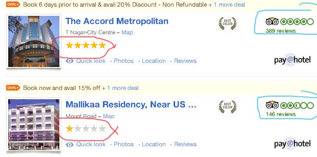
Since we see these kind of star ratings in most sites (like Redbus for bus ratings), we assume these are user ratings given for these hotels. But these are just an indication what-star hotels they are. i.e. 5 stars indicates it’s a 5 star hotel; 1 star indicates it’s a 1 star hotel. That’s all and it has nothing to do with the user ratings and hence you can’t decide if the hotel is good/bad based on these. Those are shown by tripadvisor ratings on the right (highlighted in blue). So essentially there are two ratings which are completely different from each other. This problem is seen in makemytrip and Yatra as well.


I also never understood the intention behind mentioning “Booked <time> ago”. It is seen in the other two sites as well. Probably it’s to tell the user that the rooms are getting booked and the hotel may run out of rooms; so book your room asap?
MakeMyTrip
Here is how it happens in Makemytrip after clicking on search:

The results page looks like this:
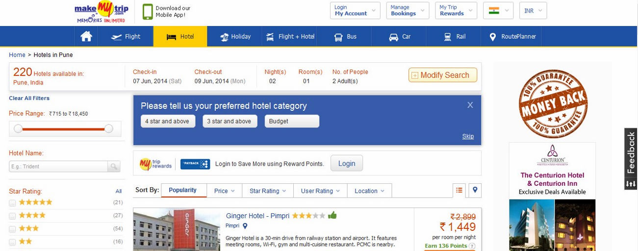
Lot of clutter when compared to Cleartrip; Two things that block the view from showing more results — “please tell us your preferred hotel category” section and “my trip rewards” section both of which are an additional load on the user’s brain. The user is here to just see hotels. These two sections can be removed completely. The former is just a filters option which is anyway present on the left and the latter — something to make users login to save points which 80% users don’t care. So it can probably come at a later stage.
Makemytrip’s design (and also Yatra’s) treats each search result as an individual entity by separating them with border and box-shadow. Whereas Cleartrip does a nice job with Typography and proper white spacing to simply differentiate the results and not treating each result as one group.
YATRA

And here is what happens in Yatra:

After clicking on “Find hotels”, a popup comes saying something about “QuickBook” and asking me to register. Not only I, as a user, don’t know what Quickbook is but also I don’t give a shit. Just show me the search results, damnit! And after this, there are about 4 different loading indicators before the results come up. No idea what and why.
Coming to the listings page design, it looks very very noisy. There are too many problems here.

2. Chat with friends — Seriously? Here? with whom?? why?

3. Redundancy: The search information (place and dates) are shown twice –

4. There is only one result that is completely seen above the fold. (and half of second result) This shows that the page is poorly designed.
5. There is no proper feedback given when the user shortlists a hotel.

6. There is an option to close a search result. Why?! It’s not a file on my computer!

7. The filters in Yatra are not as good as those in the other two sites.
& there are many more issues with the page layout and design.
P.S.: I don’t work for or represent any of these three organizations in any manner. I just wanted to flex my UX muscles and merely share my observations as a neutral customer. My name is Ravi and I am a product designer at Hatchforce.
Stay Tuned for the Part III
![UI / UX Comparison Of ClearTrip, MakemyTrip and Yatra For Hotel Bookings [Part II]-Inc42 Media](https://asset.inc42.com/2023/09/featured.png)
![UI / UX Comparison Of ClearTrip, MakemyTrip and Yatra For Hotel Bookings [Part II]-Inc42 Media](https://asset.inc42.com/2023/09/academy.png)
![UI / UX Comparison Of ClearTrip, MakemyTrip and Yatra For Hotel Bookings [Part II]-Inc42 Media](https://asset.inc42.com/2023/09/reports.png)
![UI / UX Comparison Of ClearTrip, MakemyTrip and Yatra For Hotel Bookings [Part II]-Inc42 Media](https://asset.inc42.com/2023/09/perks5.png)
![UI / UX Comparison Of ClearTrip, MakemyTrip and Yatra For Hotel Bookings [Part II]-Inc42 Media](https://asset.inc42.com/2023/09/perks6.png)
![UI / UX Comparison Of ClearTrip, MakemyTrip and Yatra For Hotel Bookings [Part II]-Inc42 Media](https://asset.inc42.com/2023/09/perks4.png)
![UI / UX Comparison Of ClearTrip, MakemyTrip and Yatra For Hotel Bookings [Part II]-Inc42 Media](https://asset.inc42.com/2023/09/perks3.png)
![UI / UX Comparison Of ClearTrip, MakemyTrip and Yatra For Hotel Bookings [Part II]-Inc42 Media](https://asset.inc42.com/2023/09/perks2.png)
![UI / UX Comparison Of ClearTrip, MakemyTrip and Yatra For Hotel Bookings [Part II]-Inc42 Media](https://asset.inc42.com/2023/09/perks1.png)
![UI / UX Comparison Of ClearTrip, MakemyTrip and Yatra For Hotel Bookings [Part II]-Inc42 Media](https://asset.inc42.com/2023/09/readers-svg.svg)

![UI / UX Comparison Of ClearTrip, MakemyTrip and Yatra For Hotel Bookings [Part II]-Inc42 Media](https://asset.inc42.com/2023/09/twitter5.png)
![UI / UX Comparison Of ClearTrip, MakemyTrip and Yatra For Hotel Bookings [Part II]-Inc42 Media](https://asset.inc42.com/2023/09/twitter4.png)
![UI / UX Comparison Of ClearTrip, MakemyTrip and Yatra For Hotel Bookings [Part II]-Inc42 Media](https://asset.inc42.com/2023/09/twitter3.png)
![UI / UX Comparison Of ClearTrip, MakemyTrip and Yatra For Hotel Bookings [Part II]-Inc42 Media](https://asset.inc42.com/2023/09/twitter2.png)
![UI / UX Comparison Of ClearTrip, MakemyTrip and Yatra For Hotel Bookings [Part II]-Inc42 Media](https://asset.inc42.com/2023/09/twitter1.png)