


Ankit Oberoi
Ankit is a co-founder @ AdPushup (a tool which helps online publishers optimize ad revenues) and loves online marketing & growth hacking.
As we all know, Banner advertising is a widely used mode to monetize websites.
But at the same time, as it stands right now, in terms of promotion, it fails to generate enough revenue for publishers or provide any significant ROI, for majority of Advertisers.
Lets look at some stats:
- In year 2012, according to a comScore’s report, about 5.3 trillion display ads were served to U.S users, but 3 in 10 ads were never seen.
- An average Internet user is exposed to 1,707 banner ads on a monthly basis.
- Want to know the average click through rate? It’s a mere 0.11%
In this article we are going to focus on one of the major culprit responsible for this horrifyingly low response rate – Banner Blindness. Not only that, we will also explore some powerful ways to minimize the effects of Banner Blindness which can help publishers significantly improve their ad revenues.
What is Banner Blindness?
Banner blindness refers to a phenomenon whereby website users consciously or unconsciously ignore or skip banner advertisements or information present in a banner like fashion. One measure often used to indicate the effectiveness of a particular banner is its Click Through Rate (CTR), which is a percentage calculated by dividing the number of clicks by ad impressions.
Benway and Lane coined the term “Banner Blindness” in 1998, who over some experiments found that even after trying to make banners- large, attention grabbing and brightly coloured, they were still ignored by participants who were looking for specific information to complete the assigned task. The banners were also ignored even when it was embedded with helpful information regarding the task. They also found that banners located on top of the page (away from important links) were ignored more than those located lower on the page (near important links). Many experts believe that when users browse through a website, they are in a “search mode” and hence ignore anything irrelevant.
The Information Overload
It has been long believed that to get something noticed, it needs to be conspicuous, stand out and be visually different from its surroundings. But, on the contrary, research on banner blindness has shown that any obvious links and messages, which stand out from the content, are often skipped or ignored.
How is information overload affecting our readers from noticing the banner displays? Psychologists believe that because of the overwhelming amount of information that is bombarded onto us from different media sources like television, radio and telephone people are becoming less capable of comprehending all information presented to them. With Internet, people have access to all kinds of information, and with the increase in amount of websites and blogs claiming to be the number#1 source; people are finding it hard to identify quality content.
Plus, with Internet sources being advertised on every TV ads and radio commercials, people are learning that more information does not always equate to better information. When people browse a website, they are usually looking for a specific information. They skip over irrelevant content and often look through “scannable” content like the navigation bars, lists or headings.
What Jakob Nielsen tested in 1997 is still relevant today. People are leaning to tune out “fluff”, so they can avert the occurrence of information overload.
Cognitive Schemata
According to Don Norman, co-founder of Nielsen Norman group, online users often use cognitive schema when they find themselves on a new website.
A cognitive schema is a mental framework, which helps organize knowledge, expectations and beliefs for a particular topic. These are very vital because they help us take shortcuts when we are in a similar environment again.
When a user finds themselves on a new website, they use stored schemas to help direct their focus to promising areas where they expect to find the information they are looking for- areas where they found the info when they were faced with the same situation previously. This often leads to traditional ad locations, like the right side of the web page, to be ignored.
How it affects Publishers/Bloggers/Webmasters
Placing banner ads where users can’t see or are primed to ignore them can affect Click Through Rates. Areas like the top-right corner of the website or the right sidebar is often skipped because people consciously/subconsciously associate them with ad areas.
In the beginning when banner ads were just starting to appear on websites, it was found that curiosity lead people to click on anything “shiny” or convincing enough. Over the years though with websites flooded with ads, people have become habituated to them and learned to ignore them. This is obviously bad news for bloggers and webmasters who wants to monetize their blogs through PPC based ads.
How do we find these Blind Ad Spots?
Fortunately, there are some robust analytical software available today, that can help bloggers and webmasters measure the effectiveness of their current ad placements.
The Eye Tracking Usability Testing and Heatmaps
Eye tracking and heatmaps have been used for digital research experiment as a means to measure a user’s cognitive activity for a very long time. For websites, it is a process through which a user’s optical movements, while on a web page, is tracked and analyzed to improve the website’s conversion rate.
The data collected through the process can provide insights about the quality of user experience, what type of content attracts their attention (images, texts, videos etc.), what the visitors are focusing on, and what spots they are ignoring. It can also show how far along the visitors scroll down the page, whether the visitors are scanning or reading through the page, and how the visitors are navigating the website.
Using those eye track patterns, testers can produce heatmaps, which shows the spots that received most attention and the spots that were ignored, leaving it dark. As a Webmaster, if those blind spots contain any vital information or the ad units, you may want to rethink the layout.
Like most usability tests though, eye tracking in itself won’t tell you much on its own. To get the most out of these tests, you need to ask good questions. Many experimenters go about gathering these data through task oriented tests, which focuses on how a user went about completing a specific task.
A study that asked its participants to find our country’s current population on the U.S census bureau’s website, even though the answer was located on the site’s homepage in the top right corner in bright red color, found that 86% of the participants failed to find the right answer.
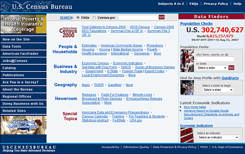
How could they ignore such readable and clearly visible information? One reason is because it was heavily formatted and presented in a promotional, advertisement type format. Heatmaps showed that users did scan that part of the website where the answer was located, but they didn’t actually read the entire number itself, just the first three numbers. 1/3 of the participants did not see the population clock. The users who did, most of them didn’t use it, even though it contained the answer.
Results from eye tracking tests can be used to optimize web pages by changing layouts, colors, buttons and images, making the website more usable by placing the correct element at the correct place.
Conquering Banner Blindness
Banner Blindness cannot be completely eliminated because of the varying and evolving user search pattern, BUT its effects can be significantly minimized through appropriate testing and understanding how users behave when searching or accessing a website.
How humans read Web Pages
A website is comprised of several different elements- each varying in its level of importance. For a website to be profitable or for its goal- whether it be sales, an opt-in or an ad click- to be met, ideally it needs to situate the right pieces at the right location.
Wouldn’t it be wonderful if you knew in advance how people read a web page? So you know what to present them where, so that you get them to take the expected action- in this case noticing the ad and clicking on it, provided it is relevant.
The good news is, several experiments have already been done to understand the general reading pattern of Internet users.


The F Pattern– A study done by Jakob Neilsen where he observed the reading pattern of over 232 users, he found that the dominant reading pattern that was consistent across all users resembled the letter “F”. What he found is that the people first read in a horizontal fashion across the upper portion of the content section. Then the user moved down the page and went on to read in another horizontal fashion, but this time the movement across got shorter than before, just like the second bar in the letter “F”. Lastly, the user, in a vertical fashion, scanned the left side of the page.
Off course, there are some exceptions to the above mentioned reading pattern. Some users might have a reading pattern that looks like the letter “X” or an inverted “L”. But the majority, roughly follow an “F” shaped pattern.
Another research that looked at Attention and scrolling habits showed that users spent 80% of their time above the fold and 20% below the fold. He also found that the users spent 69% of their time scanning the left side of the page and only 30% viewing the right side.
The Gutenberg Design– This pattern gives a general idea about the eye movement patterns when a visitor views a content heavy page. According to the Gutenberg rule, the web page is divided into 4 quadrants- Primary optical area, Strong fallow area, Weak fallow area, and Terminal area.
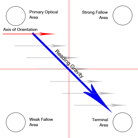
The Primary optical area refers to the upper left section of the page, and it receives the primary attention regardless of the users’ intention of using the website. Then the user sweeps across to the second quadrant- the strong fallow area, which is located at the upper right section of the page. This is the area where users will usually stop. Then next section the user sweeps to is the Weak Fallow Area which is the lower left section. Users don’t generally pay a lot of attention to this section. Next is the terminal area, which is the lower right section. This is a great spot to put any kind of call to action.
Web pages that follow the Gutenberg rule is said to be in accordance with the reading gravity, which for western users is left to right and top to bottom.
That said, it is important to realize that these reading pattern strongly exist primarily in text heavy and evenly distributed web pages; pages that do not contain a visual hierarchy. In cases where you create your own visual hierarchy, the patterns mentioned above no longer apply.
In this case, the most dominant element will act as the focal point where most eyes will first lay. The eyes will be pulled next to the element that is second in the visual weight order. Each element varies in visual weights, and that will dictate the order of the visitor’s eye path.
A study that tracked the eye movements of 46 participants found that when users first visit a website, they look at upper left corner of the page. Another eye tracking research, conducted by Missouri University of Science and Technology, found that website visitors spent 2.6 seconds scanning the website before focusing on a particular section. The 5 sections that drew their attention, in the order of the amount of time spent includes- the logo (6.48 seconds), the main navigation (6.44 seconds), the search bar (6 seconds), the written content (5.59 seconds), and the website’s main image (5.94 seconds).
Using Color schemes
Colors can influence people physically and psychologically. Although this topic, just like all the other ones we have covered in this article, could be an article of its own, we are going to cover some important fundamentals without getting too technical.
Basics of Color Theory
Colors evoke different reactions in different people. It is seldom that we find one color in a website. Usually, we use a color palette filled with different shades. What is important is how these colors interact with each other and work together to bring attention and focus on the correct segments of the page.
Here are three factors to keep in mind when thinking about color combinations-Complementation (how colors interact with each other), Contrast (used to create a sense of division between elements), and Vibrancy aka the brightness or darkness (used to dictate mood).
Now, let’s look at some color schemes. Your color scheme will depend on your dominant color(s). This can come from your marketing material, logo, or your website’s context. One great way to pick a dominant color is to first think of words that describe your website/company, and then select a color that closely mirrors those words.
Monochromatic color scheme– With this scheme, your color palette contains different shades of the same color, be it blue, orange, green or any other color. This scheme plays with saturation and opacity of a single color. When used, it can project an elegant and clean look. If needed, white and black colors are recommended to break the monotony.
Analogous color scheme– The color palette, in this case, will include colors that are right next to each other in the color wheel. Often times, one color will dominate, the second color supports the dominant color and the third color acts as an accent.
Contrasting color scheme– These include colors that are found exactly opposite to each other. Examples include red and green, orange and blue, yellow and violet. The right contrast needs to be used to keep the look vibrant; too much can look cheap and painful to look at. In most cases, this scheme will not bring in more clicks.
Triadic color scheme– These include a triangle of three hues (colors) that are equally spaced out in the color wheel. Often times, one acts as the dominant color and the other two as accents. The great thing about this scheme is that it cannot look garish because each colors balances out the other two very well.
What’s your goal?
If your goal is to get more signups- it is best to use a color scheme with colors that make the opt-in form stand out.
If your goal is to get more clicks, it is best to make your ads blend in with the rest of the content on your website. One way to do it is to make sure that the ad’s background, text and link color are the same as your post title, or text. This way the unit will look like an internal link rather than an advert unit. If placed right next to the post, make sure that the borders are removed. Having said that, no two websites are alike and I have seen sites, which make their adverts stand out and they can still perform better, so the best thing to do will be to A/B test this, more on this later.
Remember what your website is about. If it is food related, colors like orange, yellow, and red will work well. Cool colors like blue and greens showcase trust and can be used on websites focusing on medical topics or outdoor activities.
Choosing the right color can boost your brand recognition, readership, comprehension and even conversions. It can also help keep the case of banner blindness at bay.
Fewer Ads or more Ads?
It is not rare to find websites that are filled with ads in all possible locations. Does a page with more ads mean a higher CTR, or is it the opposite?
Studies show that people have an attention cap when it comes to viewing online ads. They can only view a certain amount of ads per day.
We often wonder after bombarding our visitors with ads as to why they aren’t performing? The reality is that we are putting the main thing- the user experience- in the back seat. To see any kind of profits, we need to make user experience our top priority again. Instead of putting countless ads, we need to use a minimal number of ads and focus our attention towards optimizing those few to their highest potential. We need to present the users with ads they want to see, and put it where they want to see it and at the right time.
To boost our ROI, we need to make sure that each ads on our page complements perfectly with our content. Content relevant ads have a higher chance of fulfilling a desire or need of the visitor, which brought them to your website in the first place.
Just like with content, it’s not quantity, but quality that matters. Because of banner blindness, ads that follow standard IAB formats are not very effective anymore. We as webmasters and bloggers need to be more creative and come up with new ways to serve ads. As a publisher, we need to minimize our ad slots to decrease competition between the ads. We need to sell a few ad spaces for premium prices. This will not only make sure that the ads remain high quality, but it will also improve the user experience.
Are Text Ads better or Banners in Conquering Banner Blindness?
Although flashy banner ads attract more attention, they don’t hold it very well. Simple text ads, on the other hand, seamlessly blends with the consistency and flow of the website. Text ads often match its surrounding editorial content. A study shows that text ads receive the highest views and more attention especially if the ad has the same background color as the web page. One reason as to why this happens is because most text ads are related to the subject of the website.
Banner Blindness on Mobile
Banner blindness has infiltrated the mobile advertising realm, forcing the advertisers to be more innovative and revitalize their ad serving strategy. But with the mobile market booming exponentially, it would be foolish to ignore it. This is why big brands are searching for new ways to capture their audience’s attention.
In an attempt to reach their mobile audience, Oreo came up with a very innovative mobile campaign with its “ Twist, Lick, Dunk” mobile game. The game has proven to be a major hit with 3.1 million users. Forever21 is another major brand that is going where their customers are. Majority of their target audience is social media users- especially the famous picture sharing website- Instagram. Their account has over 1 million followers. They have their customers and friends take pictures of their outfits inside dressing rooms, which they then curate with buy links, and post on their Instagram account.
If their followers like what they see, all they have to do is click on the link to buy the outfit.
McDonald is another brand that is leveraging on this lucrative market by presenting users with personalized ads based on the time and location.
Mobile ad market is surging, and brands are recognizing the power of this industry. In 2012, the global mobile ad spending skyrocketed by 83% to about $9 billion from $5.3 billion in 2011.
A/B Testing Ad Units
Sometimes all it takes is moving the ad unit to the left of the webpage, or a simple change in background color is all that is required. Small tweaks can result in significant rise in revenues.
This article presented you with many powerful facts that you can integrate into your website and campaigns. But to get the most out of the results, you need to A/B test on your ad units. Nothing beats actual stats to prove what works and what doesn’t.
It allows you to test two or more versions of an ad unit (different location, size, color) to see which one does better.
A/B testing is the only way to know which location, color and creative combination will bring in the highest number of clicks.
A small plug: If you are finding the process too tedious or complex, we at AdPushup have made split testing and continuous optimization very simple for Publishers. We help you A/B test ad units with varying ad sizes, designs and placements.
Conclusion
To minimize banner blindness we cannot forget what caused it in the first place: incessant bombarding of ads in front of uninterested users. If the ad meets their desire, visitors will click on it. A flashy red banner is not required. There are inherent facts as well, which are common among many users, like reading in a “F” pattern. It shows how important eye path and location is.
I hope this article was helpful and conveyed some interesting points that you can implement and see results. That said, I would reiterate again the fact that nothing beats testing. It is more important than ever.