


Brand redesigns are vital for helping companies enjoy a strong and continual presence in the minds of their consumers. Here are companies that have embraced change for a variety of reasons ranging from change of focus or leadership to competition and public disgrace.
Mozilla
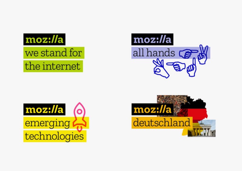
Mozilla is the company behind the world renowned open source browser Firefox and email client Thunderbird. After a rocky 2016 that saw its senior team plagued with controversy, the company revitalised itself by releasing a logo that harkens back to its early days during the dot-com boom. The new logo is simply its name, will the “ill” section replaced with a colon and two slashes. This not only brings something new to the table, it also leverages the company name’s familiarity with its target demographic (web users.)
MetLife Rebrands After 30 Years


MetLife has adopted a new logo and marketing strategy in recognition of its shift in business focus from groups to individuals. Its new tagline emphasises this approach, “MetLife. Navigating Life Together.”
HA&W Becomes Aprio After 65 Years

The accounting firm HA&W, which has served more than 5,500 clients over 65 years, has rebranded itself in order to better reflect its current activities and the fact that the namesakes behind the initials have all passed away.
Subway

In the third quarter of 2016, Subway announced a new corporate brand that will be rolled out this year. The company is simplifying its logo and business name design to emphasise its focus on staying fresh and relevant with younger audiences. This is an attempt to halt a decline in sales, which exceeded 3% in 2015.
[This post by Jon Westenberg first appeared on the official website and has been reproduced with permission.]