


Design inspiration can come from almost anywhere, from the halls of fine art galleries to your kitchen countertop. While too many drivers may use their time behind the wheel to look at their phones (please don’t be one of them!), the road can actually provide a rich source of design wisdom for the people who make mobile app UIs.
Next time you find yourself stuck in traffic, look around — rather than curse the fates for your latest bit of bad driving luck, see what contemporary automobile manufacturers are doing right (and wrong) when it comes to design, and think about how you can take those lessons back to your desk. As both car lovers and mobile app geeks, these are just a few of the things we’ve learned about app UI design from the world of horseless carriages.
The DeLorean: Drivers Love Bold Design, But They Prefer Performance
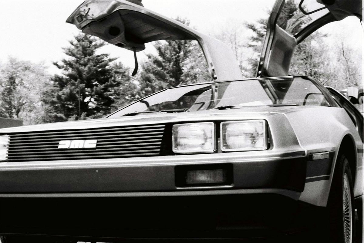
The DeLorean DMC-12, known to practically everyone as simply “The DeLorean,” has one of the most iconic, instantly recognizable designs in car history. Even if you’ve never opened up an issue of Motor Trend, watched an episode of Top Gear or given much thought to automobile design, you can probably instantly picture the brushed steel, sharp angles and gull-wing doors of this apotheosis of 1980s aesthetics.
After all, there’s a reason Doc Brown used this car to build his time machine inBack to the Future. If you’re sailing through the decades on 1.21 gigawatts of power, you should do it style.
But for all the love and nostalgia the DeLorean has received over the years, there’s no ignoring the fact that only 9,000 cars were ever made before the DeLorean Motor Company shut down operation. The short-lived vehicle was outlived by the movie franchised in which it was featured, only enjoying two years of production. Why?
The Sports Car That Barely Earned an Attendance Trophy
The 1983 liquidation of the DeLorean Motor Company was the result of a confluence of factors, not the least of which was a depressed US car market. However, it’s unlikely the DeLorean would have lasted much longer in more favorable economic conditions based solely on its merits as a car. While the car’s design said, “Drive me — I’m futuristic and fast,” the performance told a different story.
Before John DeLorean sat down to create a prototype of his iconic car, he’d originally dreamed of 200 horsepower. While certainly short of the 1.21 gigawatts required to time travel, that was a significant amount of muscle, and a bit closer to what you would expect from a car that looked like, well, that. By the time the car was made and imported into the United States, with its freshly minted emissions laws and mandated catalytic converters, 200 horsepower became about 136 horsepower — comparable to today’s least exciting 4-cylinder compact cars. This wasn’t just underpowered by today’s standards, but it was pretty bad back then, too.
And this was for a sports car, not some practical sedan or barely serviceable jalopy reserved for getting from point A to B. Nobody bought a DeLorean anticipating a sedate driving experience.
How Not to Design a DeLorean
What does all of this tell us about mobile app UI design, though? This is more than a cautionary tale about form following function. Everyone knows that the most beautiful app UI design in the world will still fall flat if the app itself doesn’t perform well — if it crashes, or hangs, or runs slowly, or exhibits another symptom of bad development and inadequate quality assurance.
However, the DeLorean is an important Aesop for anyone who designs anything that somebody else may end up making. John DeLorean had a beautiful image in his head that the actual car manufacturers couldn’t deliver. Remember that the DeLorean Motor Company was based in Ireland, and much of the performance loss came when the car went overseas to the United States and picked up a catalytic converter, losing further power.
App UI designers are like John DeLorean, while developers are like American manufacturers. You can avoid a lot of SNAFUs simply by opening up a dialogue with your developer as early as possible. In short, designers and developers can and should be friends. Discuss any possible limitations with the other members of your team, from hardware specifications to potential network performance issues — anything that might result in a really cool looking, but ultimately dysfunctional app UI.
By discussing those limitations before you even build your prototype, you’ll have a realistic idea of what’s possible with your app. Maybe certain animations or transitions are better left on the cutting room floor. Maybe certain types of push notifications are ill-advised. While many of these details will be ironed out in testing and QA, addressing them from the get-go will give you a more realistic idea of what you can actually design and build.
Your App UI Should Be More Tesla Than Prius
But for heaven’s sake, don’t make it a Hummer.
As sort of a counterpoint to the “form follows function,” or “design follows performance” argument, you also want to avoid making an app that’s highly functional and usable, but not very visually inspiring. You still want that “cool” factor, unless your app UI design has a more specifically ironic, ascetic appeal — Craigslist, we’re looking at you.
But sometimes that coolness can come at the expense of efficiency. To wit, who among us would decline road testing a Dodge Challenger SRT Hellcat? With 707 horsepower and the ability to go from 0-60 MPH in three seconds, it’s probably impossible to have more fun going in a straight line, and that’s not even getting into how good its throwback muscle car chassis looks. The Hellcat is basically what you’d get if you took the good looks and uncompromising masculinity of a young Clint Eastwood, added the speed and ferocity of Steve McQueen, turned the resulting chimera into a car and then gave the car steroids.
In short, it’s a pretty sick ride.
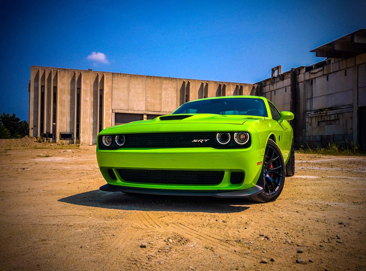
But with great power comes great, well, fuel costs. And, in this case, maybe some environmental damage. While the Hellcat gets 22 miles to the gallon on the highway — not Greenpeace-worthy by any stretch of the imagination, but maybe better than expected — it only gets 13 mpg in the city. And let’s face it, if you’re driving one of these bad boys, you’re probably not planning to be too gentle on your inputs.
Here’s the thing: while some drivers aren’t afraid to pony up the cash and eat some ozone for a wicked cool gas guzzler, no users are going to keep an app that eats up all of their phone resources. Sure, they might download it at first, thinking the features are sweet and the app UI gorgeous, but as soon as they see their phone battery tank they’ll be getting rid of that app faster than a person with a mid-life crisis can say, “Maybe I can’t afford this gas bill after all.”
Don’t make a Hellcat mobile app UI. But that doesn’t mean you have to make it a Prius, either.
What the Tesla Model S Can Teach Us About Mobile App UI Design
In the car world, the battle royale between cool cars and efficient cars looked like a sad struggle pitting the technologically sort of neat, but (let’s face it) aesthetically “meh” Prius and other slowish hybrids against the sports cars and SUVs that still prioritized speed, power and performance above environmental and financial sustainability.
That was until one forward-thinking entrepreneur came forward and posited, “Why don’t we have both?”
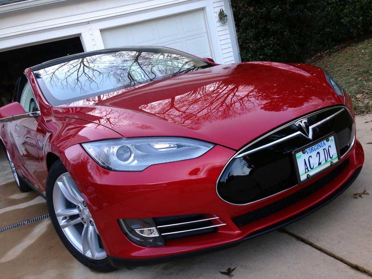
Tesla Motors is, in a lot of ways, the Apple (circa the mid-2000s, Steve Jobs era) of the automobile industry. It’s doing things people didn’t previously think possible, setting new standards for the industry and looking seriously cool while doing it. Just take a look at the Model S — not only does it do 0-60 in under three seconds, but it does it using an electric motor that makes your Prius look like an F350 when it comes to fuel economy. In addition, it has a five-star safety rating inevery single category.
But more important than all of these things, perhaps, is the fact that it’s just a gorgeous machine. While the Model S doesn’t have the flashy body style of, say, a Nissan GT-R or a Corvette Z06, it’s hard to watch a Tesla go by on the highway and not crane your neck at it. Whether you’re into sports cars, luxury cars or both (and the Model S is both), you can’t deny that the sleek, aerodynamic design of Tesla’s flagship vehicle, with subtle details like zero profile door handles, is a gorgeous piece of machinery.
The Model S is beautiful in many of the same ways Apple products are considered so beautiful: its design is simple, streamlined, luxurious. The same way a well-executed mobile app UI design should feel.
So while the DeLorean DMC-12 shows the pitfalls of abandoning performance and function and relying too much on form, the Model S shows all the possibilities that arise when you take the time to make both form and function count. Just because you don’t want your app to eat up too much memory or power on the user’s device doesn’t mean you have to make it a Prius. Don’t compromise — transcend the status quo.
People Love Custom Trim Options
There seems to be a trim package for everything these days. Whether you want aHarley Davidson F-Series pickup, a police package Dodge Charger (with ballistic door panels!) or, er, a “Kirkland Signature” Chevy Silverado from Costco (don’t worry, you don’t have to buy them in bulk), there’s a car out there with the custom features you crave.
People love options. This isn’t news to anyone. Just think about the last time you bought a car. There was probably a brand or a set of brands you were interested in — maybe you’re into domestic muscle cars, or maybe you’re into practical but sporty imports, or maybe you’re just looking for a reliable vehicle at a decent price. You might be a manual transmission aficionado, or you might be looking for all wheel drive. Even if you don’t have strong feelings about anything else, you probably have a preference for what color your car will be.
And then there are the options we need, but don’t necessarily choose. If you have any sort of back injury or chronic pain, ride quality is important, and seat warmers are more necessity than luxury. Back-up cameras are a must-have if you have any issues with neck mobility. Do you often cart around messy children or pets? You might want some easy-to-clean leather seats.
Customization is important not only in car design, but also in mobile app UI design. Building things like custom color schemes and zoom into your app UI will make your app more usable and accessible for a wider audience, while giving your users the satisfaction of choice. But it’s not just a usability thing — if your app is monetized, you might offer users premium “trim” features if they love the app enough to upgrade. This could include access to a greater variety of files (songs, e-books, game levels, etc.) or the option to use the app without ads.
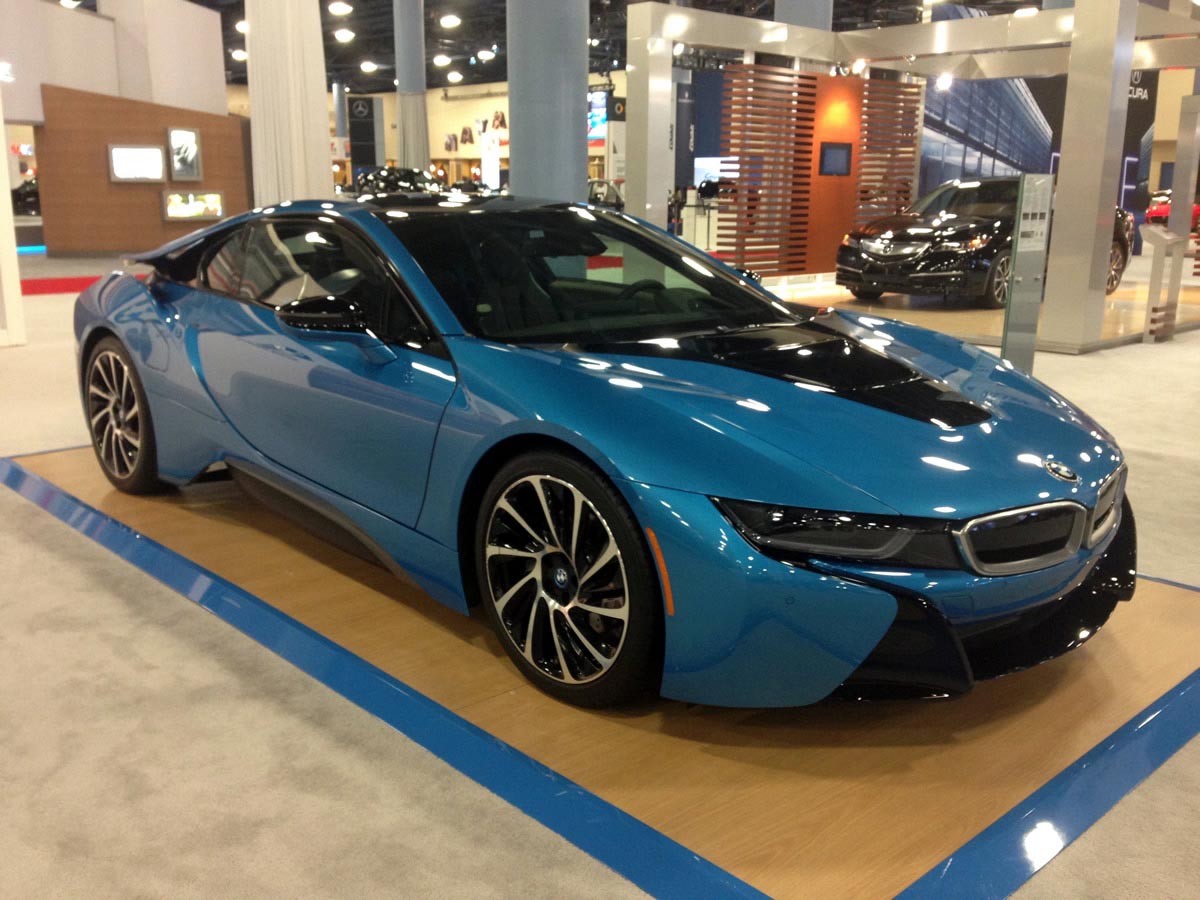
As with cars, though, you need to ensure that your base “trim” is alluring enough to bring the user in the first place. BMW, famed for its custom options, provides a reliable luxury experience regardless of whether you opt for LED headlights or blue accents on your i8 brakes. If you lock all of your app’s most enticing features behind a paywall, your users will uninstall, rather than upgrade.
What Kind of Car is Your Mobile App UI?
Whether you make practical productivity apps (maybe you’re a Volvo), exciting mobile games (if low-price, a Ford Focus ST, but if more expensive, a Porsche 918) or somewhere in between, chances are you could learn more than you might expect about mobile app UI design just by visiting a few dealerships. Go at the end of the month, and you might find yourself with a boatload of inspiration for your next app, as well as a great deal on a new ride.
Originally published on Proto Blog on October 14.


